Saturday, May 17, 2008
Performing Arts
We attended St. Joseph's Prep's performance of "The Mystery of Edwin Drood." Eileen Cella, our friends' daughter, starred with a cast that numbered --well it seemed like it-- 40. A period piece, this play within a play seems a good choice for a high school senior musical as it probably employed the entire drama club and then some. Think about the director's role: coordinating all the logistics, coaching individual performers to bring out their best, and then choreographing such a large ensemble to clockwork perfection (and they were perfect). Add to this complexity the nature of this play's variables --the audience votes on the ending and on who "gets the girl"-- so the ending of every performance is different!
It's a direct correlation to think about our own roles --both at home and at work-- as the director's responsibilities, and take a bow for making it through a different ending every day!
Saturday, May 10, 2008
Being a PAL
The rain has passed to the Northeast, and it's hard to stay here at the computer while the sun breaks through, but it's worth it when the work is this much fun... and BONUS: rewarding! For the past 8 years, I've been creating posters, tickets, programs for Phoenixville PAL Boxing events. Inspired by old time boxing posters with bold fonts, crowded with variety, breaking the rules. The PAL President, Jim Deoria, a Phoenixville cop and retired champ, built this program that has sent a couple of kids on to the pro circuit and has built the characters of many more area kids. It's an honor to have this much design fun and know it helps a worthwhile cause.
Tuesday, May 6, 2008
Spring: Forget Pantone... look out the window!
I finally updated my Pantone ink books– as I was developing a color palette as part of the re-branding process for a client in the heavily competitive field of finance. It's a good thing this project started in the heart of Winter, so I could concentrate on the job properly! This serious financial company might have ended up with apple green, pale pink and daffodil yellow for a color standard! Come to think of it, those colors WOULD be a stand-out for the financial industry...
But seriously... (not really)... the colors of Spring do always bring a smile to one's face, don't they? It may be their refreshing contrast to the previous scudding-grey-cloud days of late Winter, but it's more than the atmosphere; it is the purity of color "fresh from the tube" as yet unadulterated by heat, light, or age. It may be that because I am a gardener, my eyes are up close and personal with the center of the tulips and daffs- but that close-up reveals that the colors are iridescent - RGB, not CMYK.
Color prediction can be an important part of jewelry design - knowing fashion trends might cause you to purchase specific gemstones to increase seasonal sales. I have yet to pay for the service, but some jewelry sites offer free color prediction charts, and my experience with those have been that, while yes, I did see those colors a little more often, I can buy Vogue and get a better idea of what's 'hot.' I've found that these trends might spark a customer's interest or request for a custom piece (Early 2008: a brief flash in the pan of cobalt sparked lapis lazuli sales), but overall, I'd rather be moved by the stones themselves, and the way my sales happen attests that the buyer usually feels that way, too.
The nice thing about gemstones is that - with the light reflections, opalescence and translucence - it's about as close as I can get to that pure RGB color that Mother Nature does so well. Oh, that's right, the gemstones were made by Her, too. Thanks, Mom!
Monday, May 5, 2008
Best Lessons
The best lessons I ever get are from my clients. Celeste McQuade, an image consultant, brought me on to create logos for several of her clients. We started with old fashioned, rough pencil sketches. As I showed them to her, her excitement over the possibilities sparked a great creative partnership throughout the entire process. The curiosity, exploration and refinement that she inspired in me really brought out some of the best work I've ever done. Lesson: Be open - in your head and in your heart; listen well and dedicate yourself fully to the creative process.
Sunday, May 4, 2008
Brand Identity
It's the story of the shoemaker's kids... I'm so busy establishing new branding for my clients that I haven't thought about mine for a while! Setting up this blog forced me to take a good look, and I'm happy with my raw materials...the colors, style etc. are an accurate reflection of how I approach my work in both graphic and jewelry design.
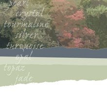
I like it when opposing styles work together, and by doing so tell the larger story. Like, when typefaces both elegant and funky complement each other; when what's natural (like the photo at right, taken when the trees began to turn) turns those colors we can't believe can be found in Nature! Somehow, it all fits.
I'll be displaying some of my work in these blogs, focusing on the jewelry, but if the clients okay it, you'll see some of the graphic design work as well.
Subscribe to:
Posts (Atom)